Secretary's Honors Program
A modern brand built to attract the next generation of national problem-solvers
Roles
- Branding
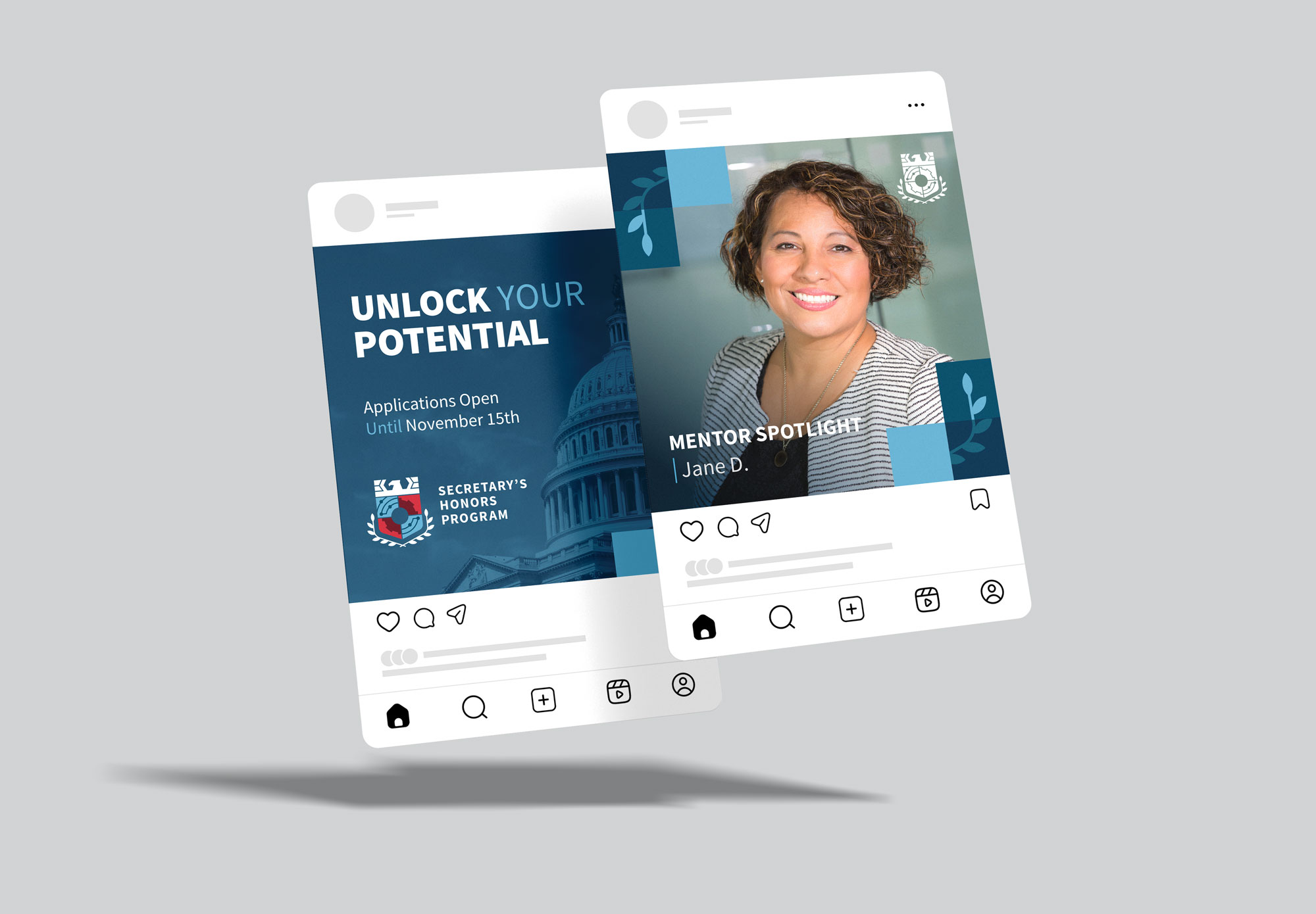
- Print & Collateral Design
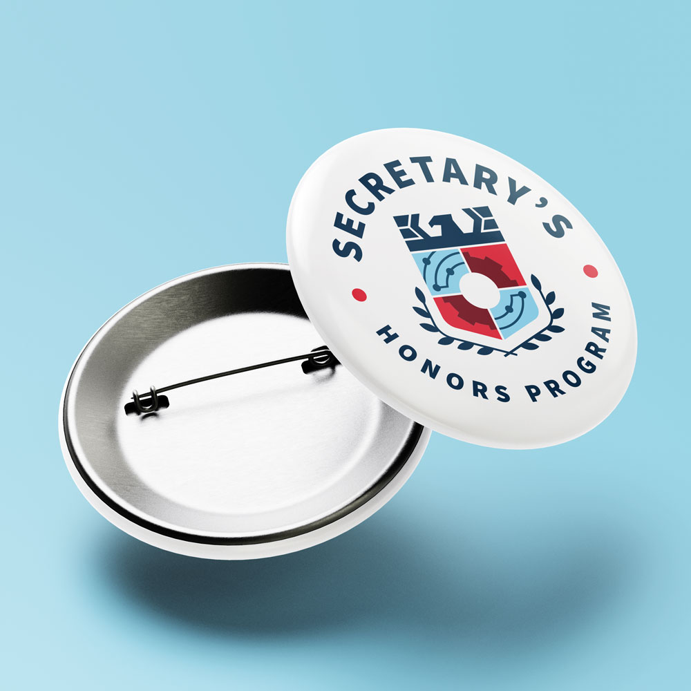
- Merchandise Design
Bridging Tradition and Innovation to Recruit Top Emerging Talent
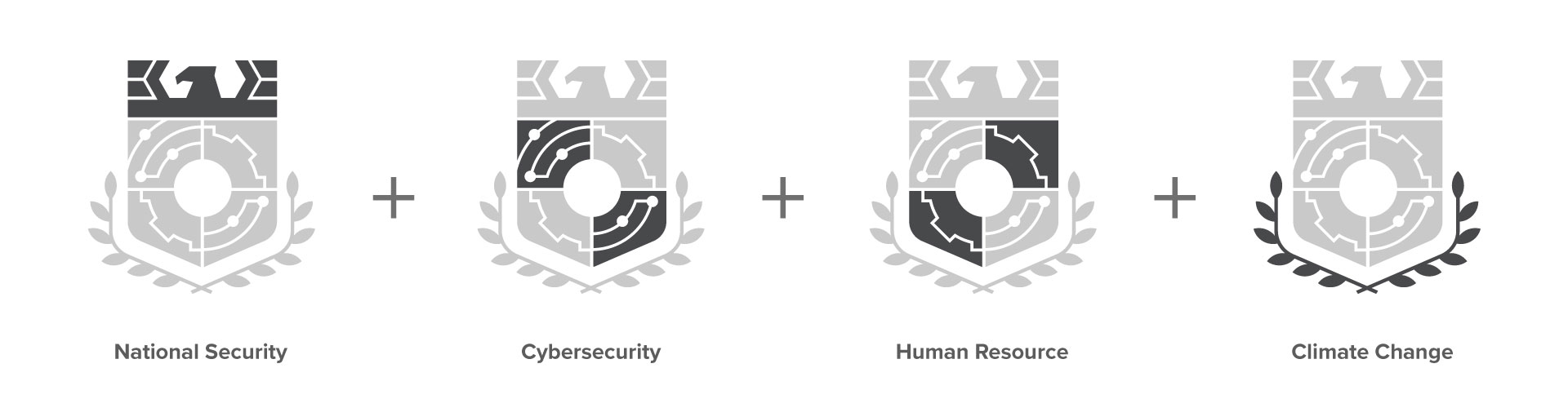
Designing a logo for a prestigious government honors program meant navigating complex brand requirements, cross-cohort symbolism, and a need for high versatility. It had to honor the unique themes of program areas such as Cybersecurity, Climate Change, National Security, and Human Resources, while also sitting clearly beneath a broader agency identity.
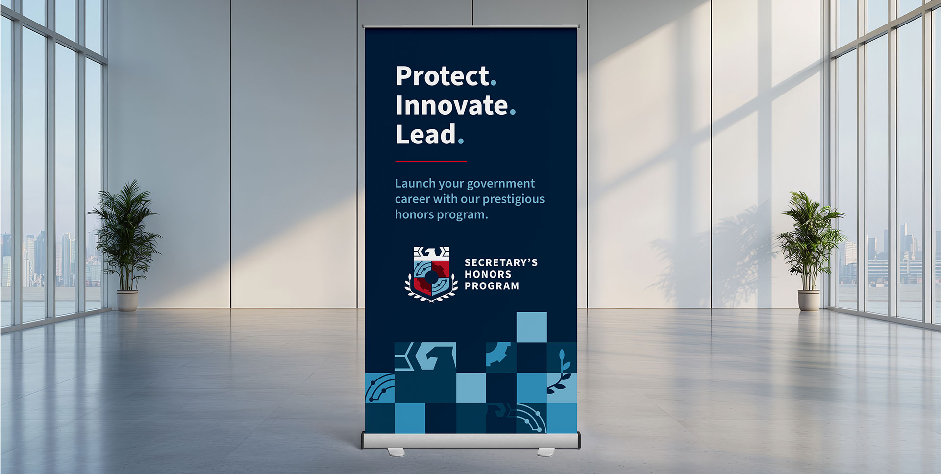
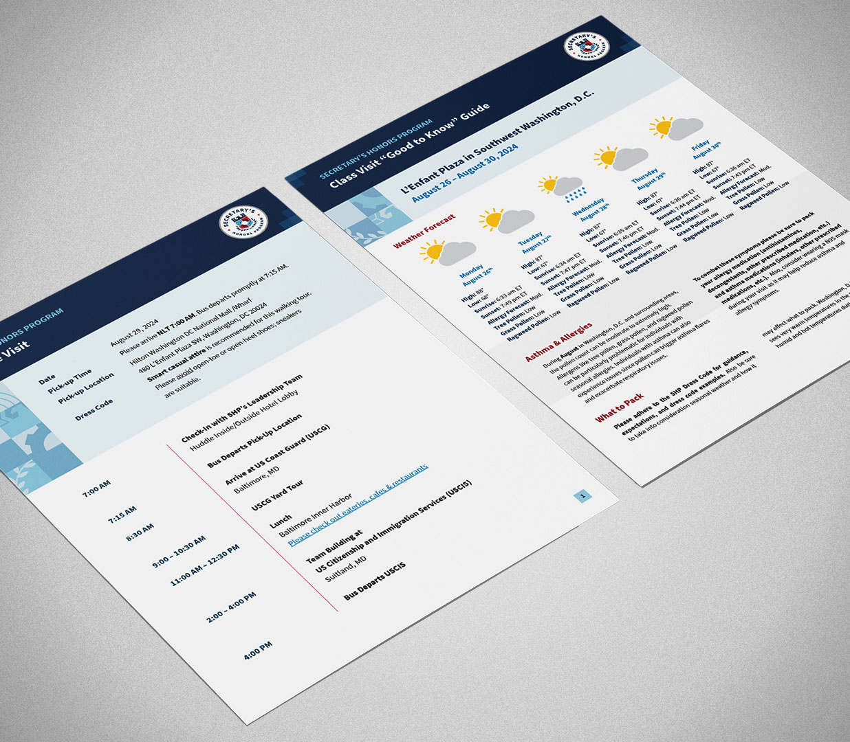
The name couldn’t be abbreviated, and the design had to scale seamlessly across digital and physical formats. Every use case, whether it was internal templates or external outreach, needed to feel cohesive and credible. Each orientation was designed for clear use across multiple platforms: email signatures, print materials, digital banners, and more.
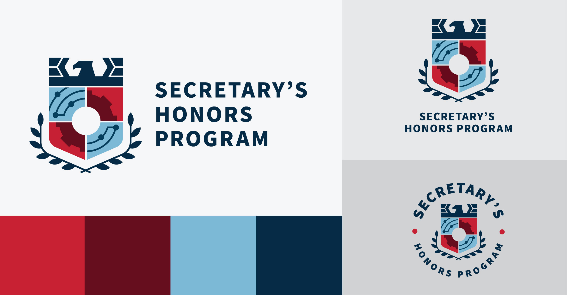
A Visual Identity Rooted In Legacy, Built For Scalability
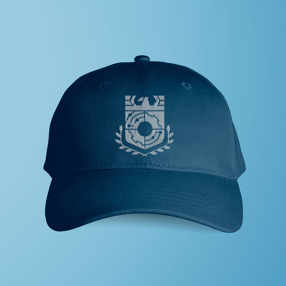
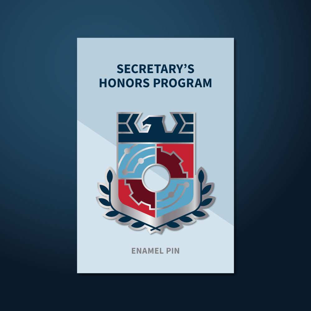
The design solution draws inspiration from heraldry – an emblematic system long used to convey identity and legacy. The resulting crest balances formality with flexibility, incorporating symbols for each cohort and echoing the program’s mission to recognize, reward, and retain excellence.

Beyond The Crest: A Flexible Visual System
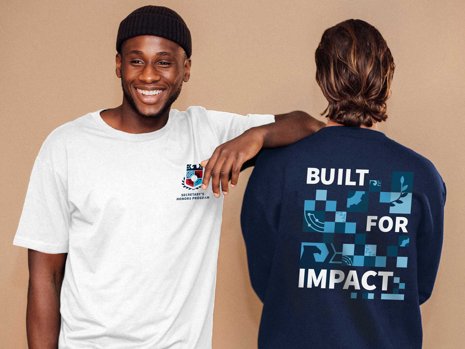
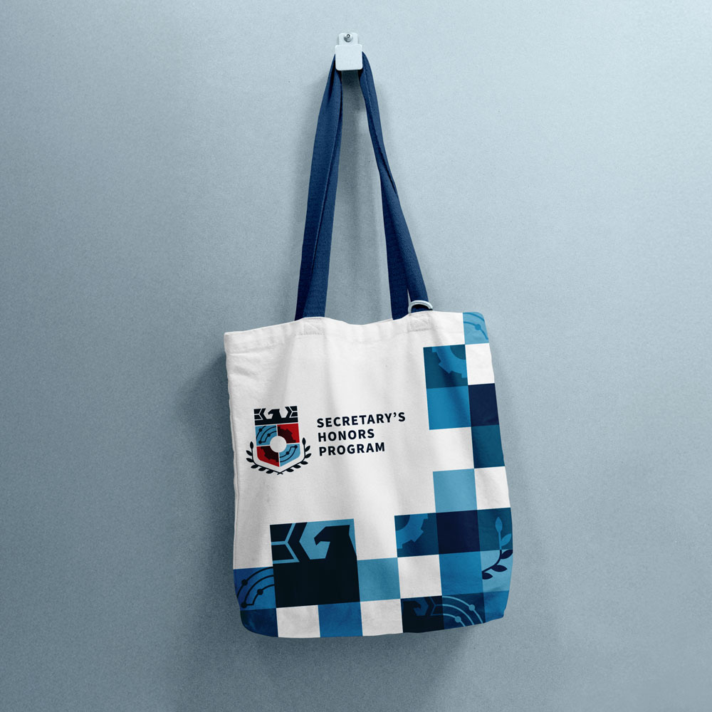
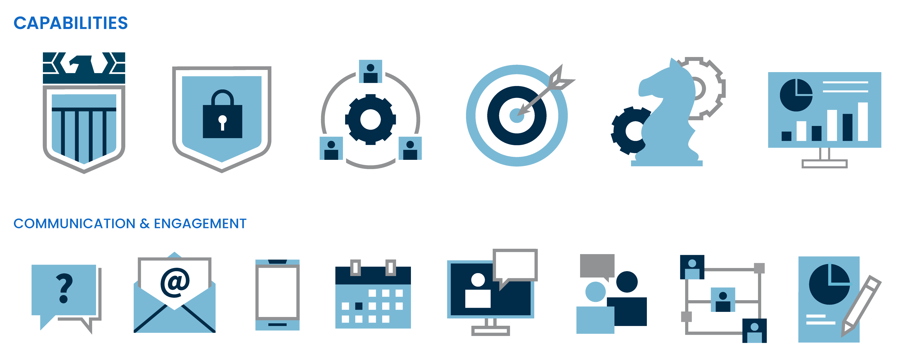
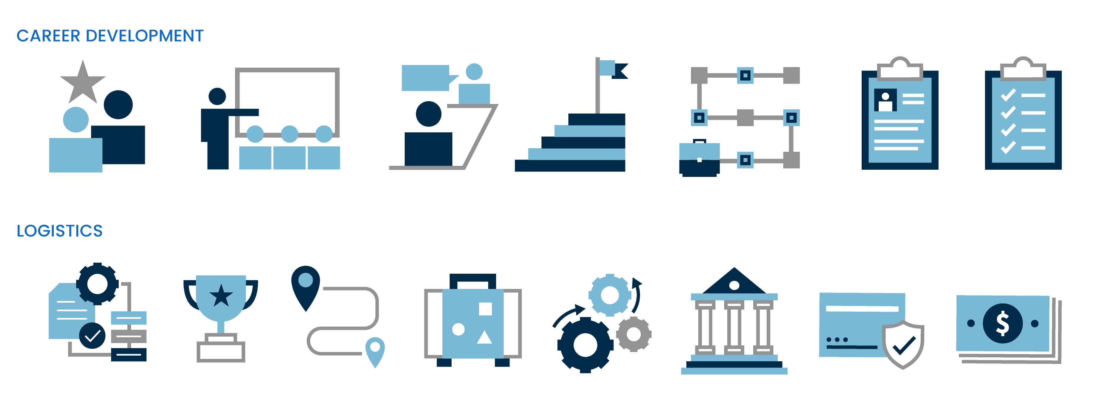
To support the core logo, I developed a suite of complementary design elements, including custom icons and branded patterns, that extend the identity while maintaining visual cohesion.
The icon set reflects key program focus areas and values, while the geometric patterns, inspired by the crest, add texture and structure across print and digital layouts. From swag to social graphics, these assets ensure the brand shows up consistently and with impact.


A Mark that Makes an Impression
From strategy to rollout, this identity system gave the program more than just a logo – it delivered a lasting, flexible brand foundation. Built to scale and rooted in meaning, the new visual identity now supports everything from outreach and recruitment to recognition and impact.